Door Decor

The painters are back and as soon as they finish painting the exterior trim it’s time to paint the doors (and shutters — but I’ll save that for another post!). This is what I’m thinking for the front door, back doors, and shutters:

BM Old Navy

I love that it’s dark, but but still blue enough that it won’t look black against the Light Mist colored Hardie plank. I’m also considering having the front door painted high gloss. I’d leave the shutters and back doors in a matte or egg shell finish.

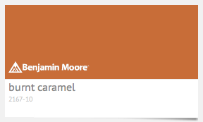
And because I’m a huge Longhorn fan and want to incorporate a little Lone Star love for the house, I’m 99% confidant this is the orange I’m going to use for our side door:

BM Burnt Caramel

Oh, and I can’t forget the ceilings on the front and side porches! I found this to be the lightest shade of blue from the Old Navy family and, based on these pictures on Houzz, I believe it is the perfect color:

BM Cumulus Coton

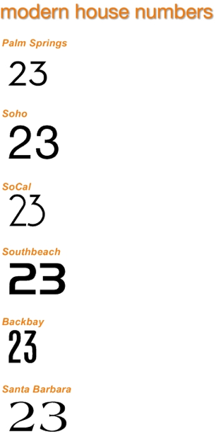
I’m also looking for new door numbers since the ones tacked up on our house were only temporary so we could get our occupancy permit. I found this fantastic website with a great selection of modern house numbers. I really like the Palm Springs version and even the SoCal, but think Santa Barbara is definitely more our style. Plus, who wouldn’t want a little Santa Barbara vibe in New England? I decided to get brushed aluminum so it coordinates with the silver exterior light fixtures, but they have other finishes to choose from. Too bad they don’t have copper to match the copper on our bay windows!

ModernHouseNumbers.com

ModernHouseNumbers.com

I’m also considering painting the inside of the exterior doors. Is that too trendy? Maybe I should leave them white, but I’m thinking it would look really pretty if I painted them Coventry Gray. It’s just a shade darker than the walls are already and might really pop without distracting from the artwork. What do you think?  

Little Boy Blue

Sara, my designer, and I like to joke that my house is the ‘Fifty Shades of Grey’ project. Most, if not all, of the walls have grey on them or in the name at least. It’s been a little confusing at times – even for the painters! – but I couldn’t be happier with such a nice, neutral palette.

My husband, on the other hand, has had concerns about the house being too neutral. He loves color. The brighter, the better. I love color, too. I just prefer to bring it in with art and fabrics. My kids, however, are much more like their father.

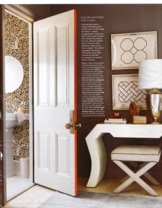
color outside the lines

via ApartmentTherapy.com

We have 3 little boys – ages 4, 3 and 2. Our littlest could care less about the wall color, but our 4 year old certainly has an opinion. And our 3 year old just wants whatever his older brother wants. Since the two little ones are sharing a room, I had to do something that would work for all of them.

At first, I considered painting their rooms, well, grey of course, but adding a pop of color by painting the edge of the door. I got the brilliant idea from an old Apartment Therapy post featuring a Martha Stewart Living article and I knew it was a good thing.

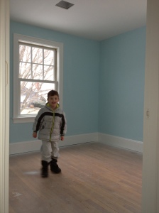
someone couldn't be more excited about his new blue room

someone couldn’t be more excited about his new blue room

However, Sara, encouraged me to add the pop of color to the wall. So, using their Serena and Lily cabin quilts as a jumping off point, we agreed on Benjamin Moore’s Crystal Springs. I was intimated at first when I saw the sample on the wall, but my husband loved it. AH Painting put the first coat up before the weekend and not only am I loving it, but my 4 year old is in heaven. “It’s my favorite color, Mommy!”

I’m still not opposed to the idea of painting the edge of their doors, but I may narrow their color choices now. In hopes of keeping the peace, I painted both rooms the same color. After all, they all have the same quilt. I’ll use different colored sheet sets and art, natch, to mix it up a bit and give the rooms their own personality.


Put The Paintbrush Down

“A woman’s mind and winter-wind change oft.”
~John Clarke

It felt like summer for a few days, but along came winter again with the below-freezing temperatures. I also changed my mind and modified my original paint selections. No, I didn’t get crazy and make drastic changes. However, the new colors do make a big difference.

a selection of Benjamin Moore grays/greys

a selection of colors by Benjamin Moore for the downstairs

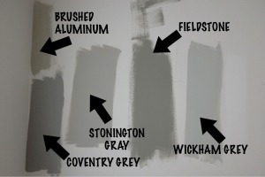
Brushed Aluminum is now Stonington Gray. Fieldstone is now Coventry Gray. Ebony Slate is now Approaching Storm. And I nixed the master bedroom color, Nimbus Grey, altogether and chose instead to use the color for the guest room, Silver Grey, in our master suite, too. The bathrooms and the boys’ rooms are still the same. (More to come on those later!)

Overall, I have to say I am soooo much happier with my decision.

After the first selection of colors samples went up on the wall they looked too brown and too green for my taste. I wanted cooler colors and suggested Wickham Grey to my designer, Sara Diem. She insisted we go a little darker, less blue.

And again, Sara was right. I stopped by the house this morning and am in looooove with the perfect shade of grey: Stonington Gray. Granted it’s only the first coat, so it’ll get a smidge darker. Still, I think it’s fresh and pops with the Chantilly Lace trim color. Don’t you?

first coat of stonington grey

first coat of stonington gray :: i’m in love

I admit with all the grey it has been a little confusing for the painters (and my husband), but it’s not totally a ‘fifty shades of grey’ kind of house. More color goes up today so I’ll be sure to snap a few more pictures. Laters, baby!

How many rounds of paint samples did you go through before deciding on the colors for your home? Are you a ‘one and done’ kind of person or did you hem and haw like I did?